We often take colour for granted, until we see something that is so vivid or beautiful that it stops us in our tracks! In the world of display, it’s an incredibly important tool in getting noticed.
Colour can be used through lighting effects or more simply through the graphics used within an exhibition stand. Use it to create an atmosphere or to present your brand in a certain way.
Let’s consider a few scenarios to start off.

Use earthy neutral tones if you want your brand to be associated with eco-friendliness or with organics.
Using these colours can create a more natural theme to a stand, and emphasise the eco qualities of the brand being displayed.
Using colour like this works more subliminally to create an overall impression and feel.
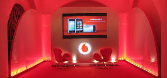
If your brand colour is red, like Vodafone, then clever use of lighting can dominate an event or stand. Lighting up a stand in that brand colour makes a powerful statement, and cuts through any other ‘noise’ in the room.
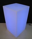
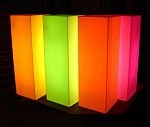
At Brandstand, we can light a display case with a particular brand colour to draw the eye to it and emphasise the connection of the product to the brand. We can also use our Plinths with lighting which are very effective and can change colour at the click of a button.

If you’re able to pick any colours for your stand, then consider what different colours mean to people. Pantone publishes a useful guide to colours and responses that they elicit. Orange tends to represent fun, happiness, tangy, juicy, friendliness and loud. Whereas light green is more trustworthy, refreshing, cool, restful and traditional. Navy is seen as authoritative, credible, classic and conservative.
Colours also go through trends. You only need to take a look at fashions on the catwalk to see ho colour trends change each season. Whether it’s neon, neutral, pastel or monochrome, colour conveys tone and helps visually illustrate a story by evoking mood and feelings. Right now neon seems to be back in trend, so if you’re appealing to a fashionable crowd consider using this to generate appeal.
Think about your target market when designing your display, as colour appeal can also depend on gender. For instance, we know that males like blue but that pastel shades appeal to females. Monochrome black and white has a timeless appeal and simplicity that creates impact.
Our Superwall Display System features dye-sublimated printing onto fabric to ensure the most vivid colours we’ve seen in the market. The lycra fabric is stretched over any shape of frame to provide a seamless and wrinkle-free surface. We used the system to create a Heineken branded wall for the Rugby World Cup, capturing perfectly that rich Heineken green.

If you want to talk more about how we can help you then give our friendly sales team a call at Brandstand – 0800 10 99 88
Did you know?
WE RUN TRANS-TASMAN CAMPAIGNS
We work with our sister company in Sydney to deliver truly Trans Tasman campaigns. The combined team will take care of all the production, project management and logistics in both New Zealand and Australia, ensuring your budget is optimised and your stress levels are reduced!